Excel dashboard
Interactive Dashboard with Excel
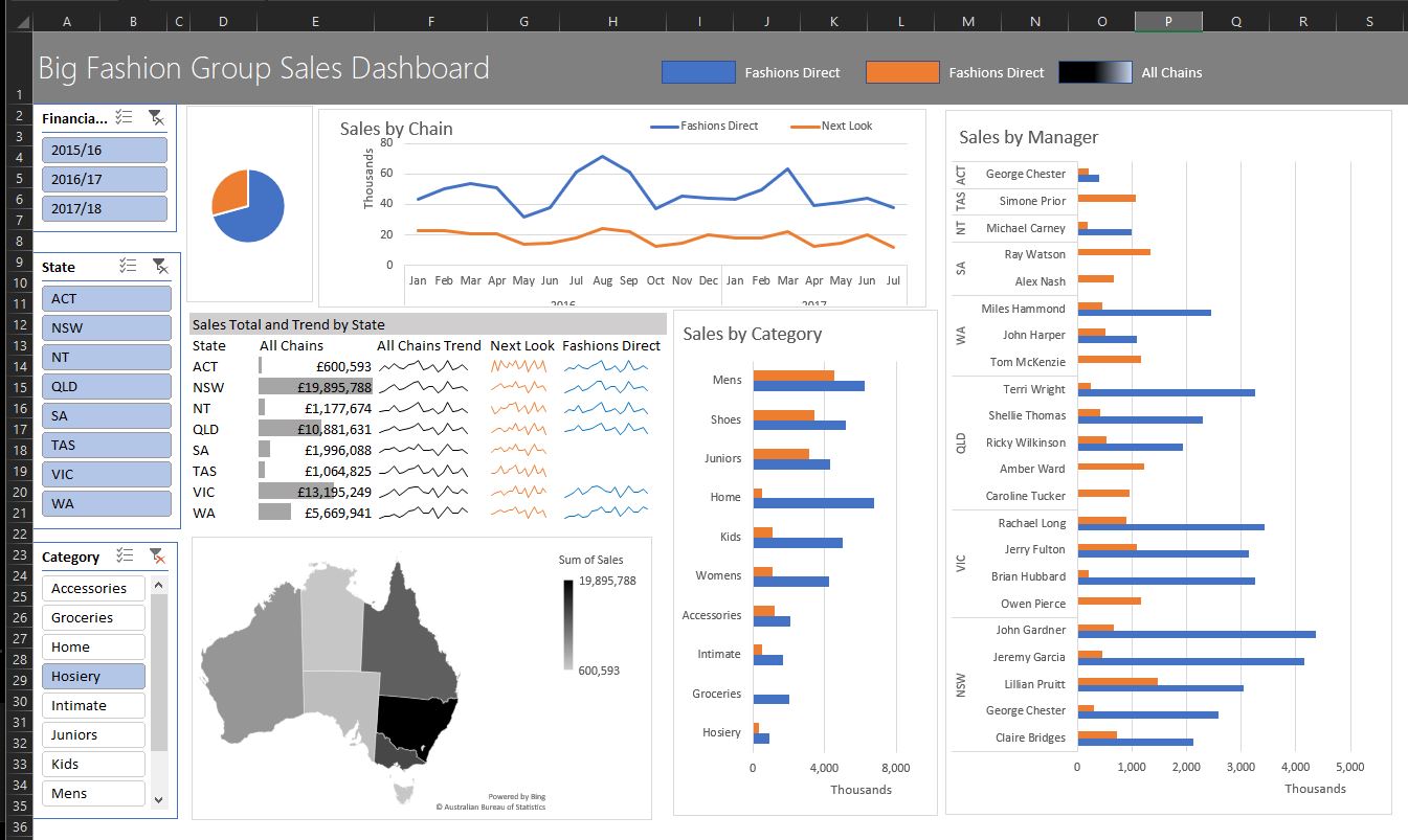
A dashboard is a visual display of the most important information needed to achieve 1 of more objectives, consolidated and arranged on a single screen so the information can be monitored at a glance.
With Excel we can make them interactive.
In this blog post I walk through the excellent MyOnlineTrainingHub YouTube - How to build Interactive Dashboards
Making dashboards is a skill.
I’m fortunate in that I’ve got control over webservers, DB and storage, and can design my own log strategy.
Like many recent projects, I’m favouring simplicity and have found that I can write sufficiently well to the OLTP DB with small to medium size projects.
User dashboard
- Who has logged in most recently
- Who needs help using our system
- Tools with most interest
- Search engines giving the most traffic (and what terms)
- End of year reports
Developer / Devops dashboard
- Email delivery problem
- 500 errors
- Critical Errors eg app pool recycle
- Unusual activity (spike in traffic)
- Too many Polly retry errors (need to up database power)
- SQL query times
- Server memory usage (can I scale up / down)
- Server disk space
- Server CPU usage (can I scale up / down)
- Days since last deploy (and therefore patch)
Alerting from the dashboard? potentially using slack for notifications like https://www.listennotes.com/blog/the-boring-technology-behind-a-one-person-23/. Maybe when a new user registers
Others
asdf
Excel
Making a good looking dashboard in CSS and HTML is tricky. Lets mock it out, and maybe it is good enough to just have it in Excel, then connect to the live db.
Also lets explore to see if interactivity is easy to accomplish
eg focus down on a date range of date eg todays 500 only
https://www.myonlinetraininghub.com/workbook-downloads downloads
Interactive Tools (Slicers) Dynamic labelling
Separate worksheets for
- Data
- Analysis (preferably one sheet for each PivotTable)
- Dashboard
Tech:
- Excel Tables
- PivotTables
- PivotCharts
- Names for - PivotTables, Ranges, Worksheets
- MapCharts (Excel 2016)
She is using Excel 2016. Slicers need 2010 onwards.
I’m using Excel 2019 2110 Build 16.0.14527.20270 64-bit. Fully updated on Win 10 as of 10th Nov 2021.
Data
Alt H O I auto format column widths
Ctrl T Format as an Excel Table. Essentially this tells Excel to treat the data like a DB. https://www.intheblack.com/articles/2018/08/01/understand-excel-format-as-table-icon
To make managing and analyzing a group of related data easier, you can turn a range of cells into an Excel table (previously known as an Excel list).
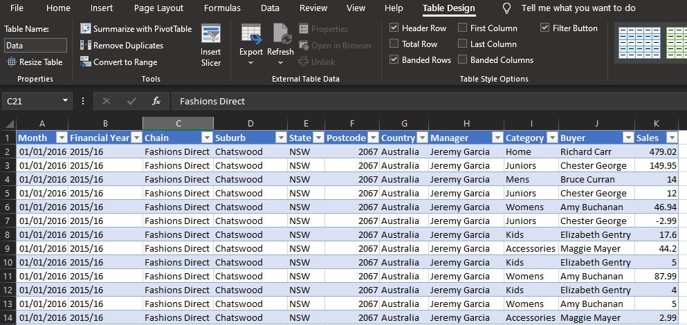
A simple CSV list of values pasted in, then formatted the first column as a date, now an Excel Table.
Table Design, name the table: Data and the worksheet data.
PivotTable
First PivotTable will be data for Sales by Chain
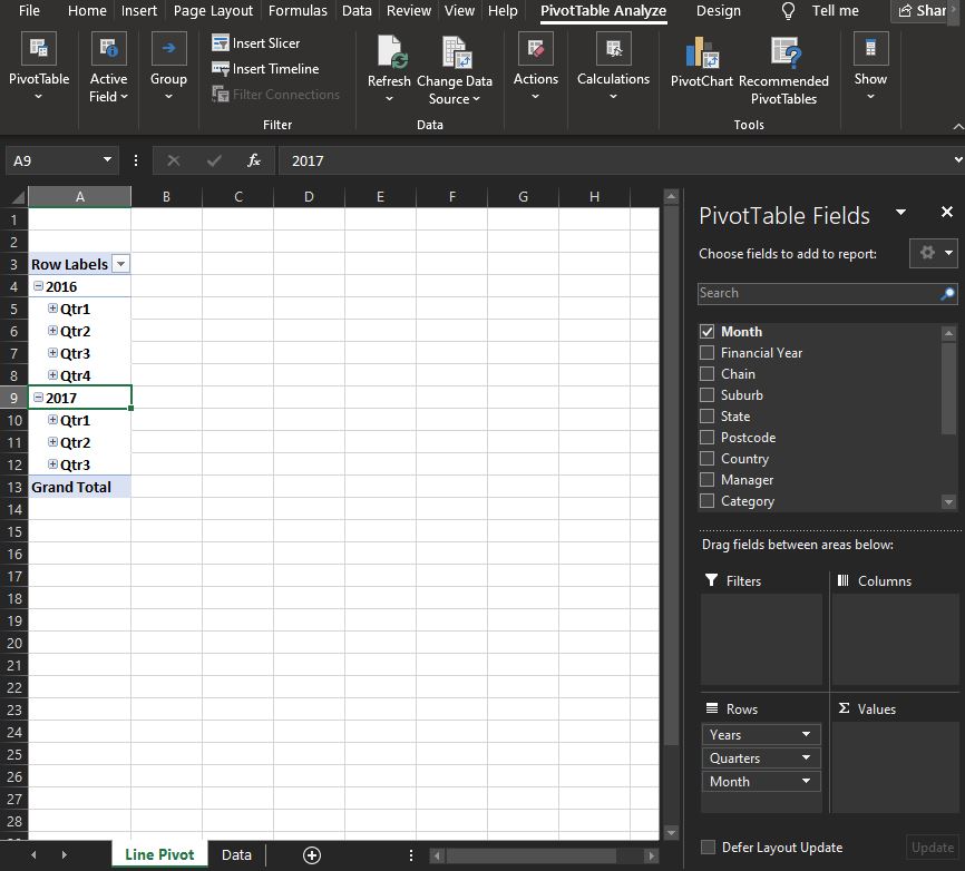
In the table, click Summerise with PivotTable, new worksheet
Call worksheet Line Pivot, and PivotTable Line Pivot
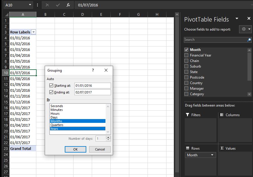
Excel 2019 automatically grouped the dates when I selected Month.
Can Ctrl z to undo that.
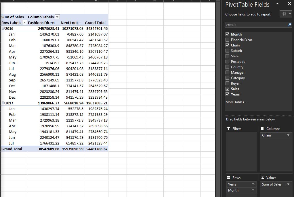
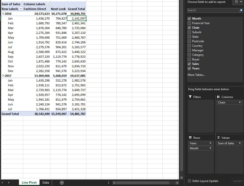
Now get Columns and Data
then
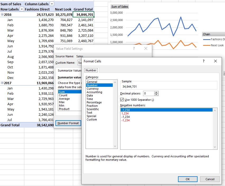
formatting Grand Total using separators, and 0 decimal places.
End of result of the data we’re going to use to build the line chart.
PivotChart
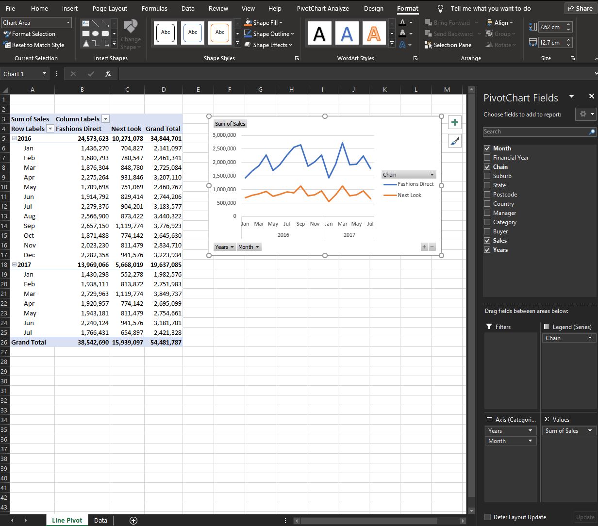
PivotTable and a PivotChart
- X Axis - Time - grouped by Years and Month
- Y Axis - Sum of Sales
- Series - 2 different Chains
Right click and Hide All Field Buttons on Chart. As we’re going to use Slices to control filtering
- button put legend on top.
Add chart title
Hold Shift to keep aligned
Webserver Data
My end goal is to make an dashboard for webserver data, so lets look at it.
I copied the data from SSMS and pasted in.
A format I used to save the data from a specific application. Notice the LoginId, Email and RoleName which comes from the application layer not the webserver.
Formatted the date column as:
yyyy-mm-dd hh:mm:ss.000 worked for fractional dates for SQL Server DateTime.
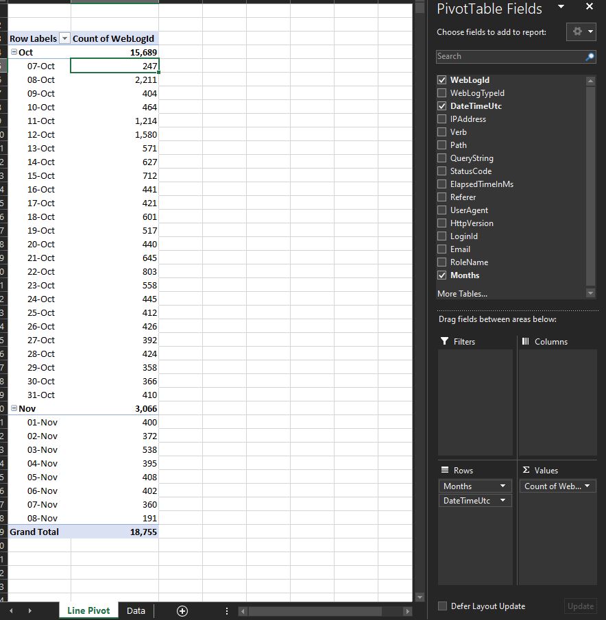
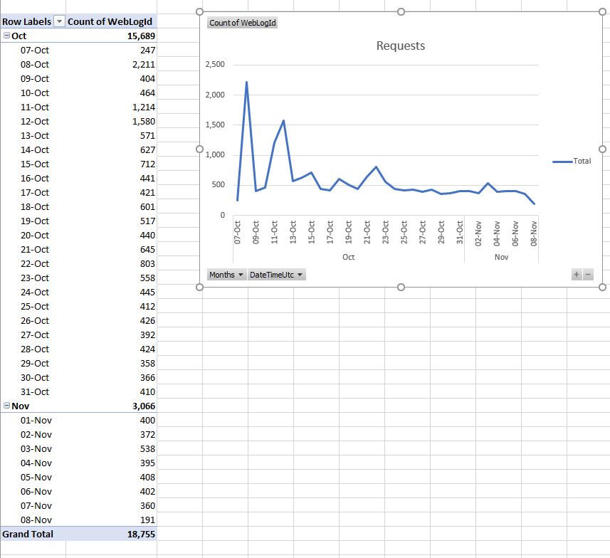
Notice instead of doing a sum, I’m doing a count of WebLogId (I guess it could be any column) to give me a total number of requests per day.
This is a big win just to see requests per day on a chart! Doing on the Webserver would involve a JS Chart library, custom CSS, and something to display the data nicely to the side. Using Excel is much easier.
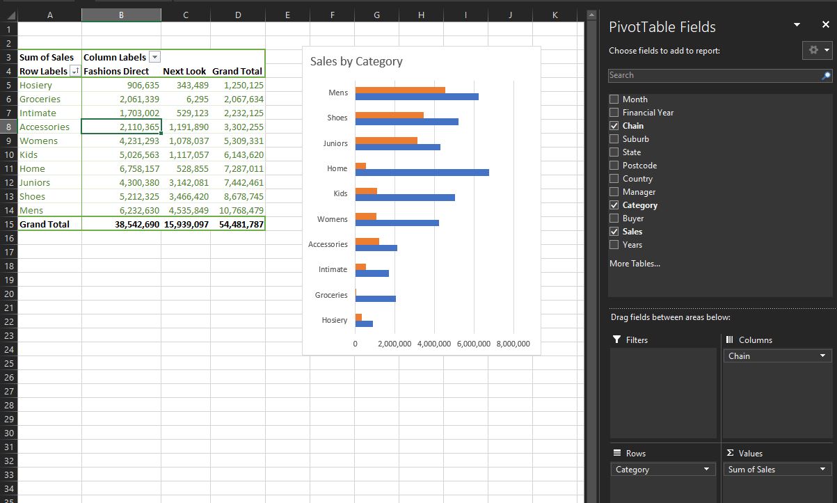
Sales by Category Br Chart
Which is going to be a bar chart.
To ensure all PivotTables share same source data and Pivot Cache is to copy. Use Ctrl left click
Delete legend as we’ll be using a global legend.
Right click on Grand Total, sort smallest to largest, so chart goes largest to smallest!
Sales by Manager (by State)
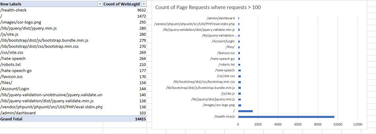
Filter by Count - SQL
I want to show only pages (paths) that have had > 10 requests.
Right click on columns in chart, value filter.
Top 10 is also a good one.
Seems like mulitple value filters are complicated. Probably better to do another way.
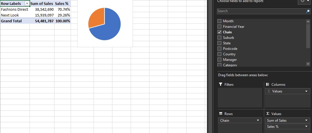
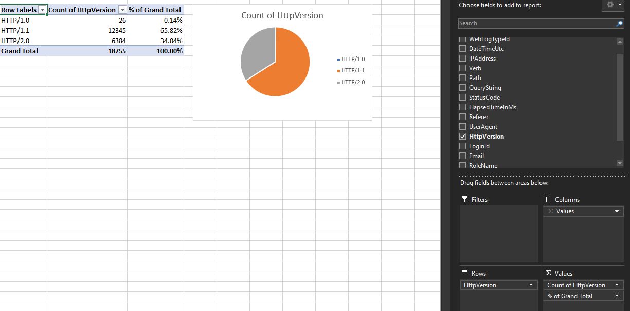
Pie Chart
She doesn’t like - probably a better chart.
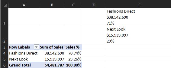
Right click, show values as % of Grand Total.
Pie Chart SQL
Nice to see the percentage of HTTP1.1 vs 2.0 requests.
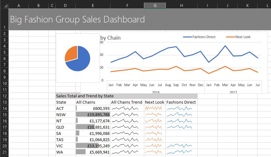
Sparklines
Needs 3 pivot tables
- Total
- Next Look
- Fashions Direct
breaking the rule of keeping 1 pivot table per worksheet. Should probably do it!
Design, Subtotals off, Grand Totals off.
Sort state labels A-Z
Field Settings, Layout and Print, Show items with no data as we want to display an empty sparkline if no data.
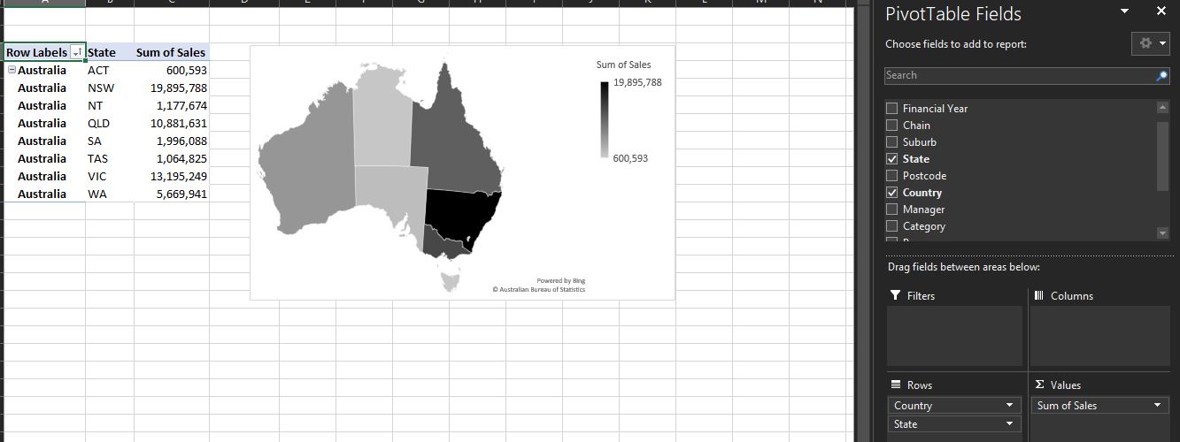
Map
Have put in Australia to be sure that Excel gets it right.
Design, Subtotals, Grand Totals - take off
Map charts don’t have a Pivot Chart equivalent, they are a regular chart.
Right click on Australia, Field Settings, Layout and Print,
- Show item labels in tabular format
- Repeat item labels
Copy data, paste as values
Insert Map, Filled Map
Now to point to back at the orig data.
Right click map, select data, Change A to C (or whatever columns)
Can now delete the pasted as values data.
Chart Design, Change Colour - monochromatic.
Dashboard
First row is a grey background
Title: Big Fashion Group Sales Dashboard
Segoe UI Light, 22, White
Cut and paste the charts to the main dashboard.
Now for sparklines:
In col D14:
=IF('Sparklines Pivot'!A6="","",'Sparklines Pivot'!A6)
If == “” then “” else what it is.
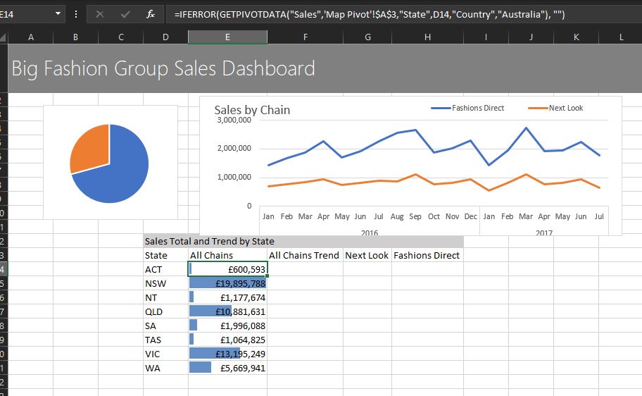
In Col E14 to get All chains, we can use the map data which contains all data
press = in All Chains, then select Map, and click on the row
=GETPIVOTDATA("Sales",'Map Pivot'!$A$3,"State","ACT","Country","Australia")
then error handle
=IFERROR(GETPIVOTDATA("Sales",'Map Pivot'!$A$3,"State","ACT","Country","Australia"), "")
then handle hard coded state by refeerencing cell to the left in the dashboard, which gives the state.
=IFERROR(GETPIVOTDATA("Sales",'Map Pivot'!$A$3,"State",D14,"Country","Australia"), "")
Format Currency, 0 decimal places.
Conditional formatting, Data bars, Solid fill
Conditional formatting, Manage Rules. Change colour (as blue means a specific chain here)
Sparkline
Select rows for sparkline
Insert, line
Bug with dynamic so select some space at the end
Change colour to black for all, orange for next look.
The hardest so far to implement.
Slicers
Insert Slicer (while a PivotChart is selected)
Turn off gridlines
Hmm for some reason my sliver only affects 1 chart.
Create Manual Legend
Rectangle Text Box, no fill, no outline
Shift to select mulitple
Ctrl Shift to copy and not move off the horizontal
Gradient fill for All Chains.
Axis, display units in thousands.
Dynamic Labels for Pie Chart
Just need to concatenate text together
CHAR10 is a line break
Type in the &, then click on the Sum of Sales
=A4&CHAR(10)&GETPIVOTDATA("Sum of Sales",$A$3,"Chain","Fashions Direct")
But take out hard coded Fashions Direct
=A4&CHAR(10)&GETPIVOTDATA("Sum of Sales",$A$3,"Chain",A4)
and then the percentage
=A4&CHAR(10)&GETPIVOTDATA("Sum of Sales",$A$3,"Chain",A4)&CHAR(10)&GETPIVOTDATA("Sales %",$A$3,"Chain",A4)
but then wrap the getpivotdata in a text to tell Excel how to format it:
=A4&CHAR(10)&TEXT(GETPIVOTDATA("Sum of Sales",$A$3,"Chain",A4), "$#,###" )&CHAR(10)&TEXT(GETPIVOTDATA("Sales %",$A$3,"Chain",A4), "0%")
Home, Wrap Text to wrap
Now we can reference these labels in our pie chart.
Insert, Shape, Text Box, into pie chart.
Select text box, press =, click on lable in Pie Pivot
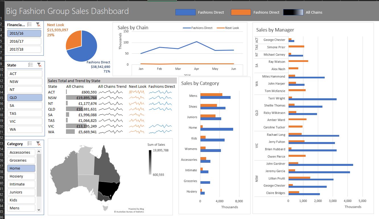
Link Slicer to All Charts
Select first slicer, right click, Report Connections, select all Pivot Tables
If can’t see all the pivot tables you are expecting:
-
For a slicer to control all pivot tables, the pivot tables must control the same source data.
-
Sometimes you can create more than 1 picot cache. Solution is to copy one of the pivit tables which is in the list, and re-create that PivotTable and PivotChart.
Financial year slicer - want to connect all PivotTable/Chart to it State slicer - all except Map. As the map is not a PivotMap.
todo - maybe Excel2019 does dynamic name ranges for charts? Or maybe there is a PivotChart Map?
It all works - very impressive. Notice that we are talking in FY’s.
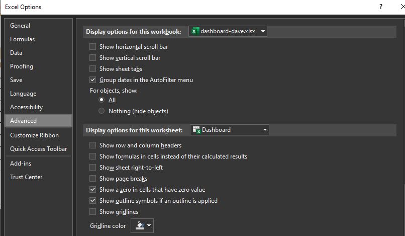
See formatting below on how to get rid of gridlines, sheet tags etc.
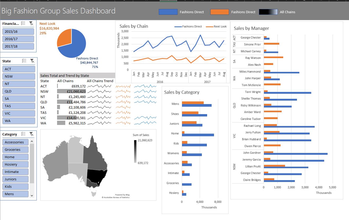
Updating the data
Patch in the August data.
Normall she would use PowerQuery, and get it automatically
Can paste the data directly under the existing data.
Data Tab, Refresh All.
Wow - very impressive
Themes
Page Layouts, Themes, Parcel is good.
Formatting
Alignment is very important.
Group elements toether so can move as one
Selet all Slicers, Align Left.
hold down ctrl, then use arrow keys to move something
Rename slicers
View Tab, get rid of headings
File, Options, Advanced, Display
- Show horizontal scroll bar
- Show vertical scroll bar
- Show sheet tags
Dashboard Protection
Slicer, Size and Properties, Disable sizing and moving.
Other ways to hide stuff too.
Embed on Web Page
Covers that on her excel dashboard course.
https://support.microsoft.com/en-us/office/embed-your-excel-workbook-on-your-web-page-or-blog-from-sharepoint-or-onedrive-for-business-7af74ce6-e8a0-48ac-ba3b-a1dd627b7773 looks like you can do it with hosting the sheet in Office 365.
SQL
show raw data
Slicer on email - then can see everything that person has son Slicer on type eg FaceSearch
slicer on dates
IP address
- country, town ideally!
- an easy API?
- cache the results on my server
